Website & Web Design · 9 min read
10 Website Mistakes That Cost Businesses Customers
Ten problems we see repeatedly on business websites, why each one costs money, and the practical fix for each.
 Mayowa AdejayanFounder, InsightWeave
Published
Most websites don't fail dramatically. They lose a few percent of interested visitors at each step until the total is significant. The ten mistakes below are the ones we encounter most often, and all of them are fixable without a rebuild.
1. An unclear headline
The problem: the first line of the page is a slogan rather than an explanation.
Why it matters: the headline is the only content most visitors are guaranteed to read. If it doesn't communicate, everything below it is wasted effort.
The fix: state the service, the audience and the outcome in plain language. "Bookkeeping for UK construction firms — monthly accounts, filed on time" outperforms "Financial clarity for the modern business" every time.
2. A weak call to action
The problem: buttons labelled "Submit", "Learn more" or "Get started", styled so quietly they blend into the page.
Why it matters: a vague CTA asks the visitor to guess what happens next, and uncertainty postpones decisions indefinitely.
The fix: describe the outcome and the commitment — "Book a 30-minute call", "Get a fixed-price quote", "See pricing". Use one visually dominant primary button per screen.
3. A poor mobile experience
The problem: the site was designed for desktop and adapted afterwards.
Why it matters: for many businesses more than half of first visits are on a phone, frequently on a slower connection.
The fix: body text at 16px or larger, tap targets at least 44px, no horizontal scrolling, and the headline plus primary CTA visible on the first mobile screen. Test on a real device.
4. Slow pages
The problem: heavy images, oversized scripts and stacked third-party tags.
Why it matters: people abandon slow pages before forming any opinion of your business, and search engines factor experience signals into rankings.
- Serve modern image formats at the size they're displayed, and lazy-load anything below the fold.
- Audit third-party scripts quarterly and remove what nobody uses.
- Avoid large animation libraries where CSS would do.
- Measure on a mid-range phone, not a fast laptop.
5. Confusing navigation
The problem: invented menu labels, too many top-level items, or key pages buried two levels deep.
Why it matters: navigation is how visitors form a mental model of what you offer. If they can't build one, they leave.
The fix: five to seven top-level items, named in customer language. Put the highest-intent pages — pricing, services, contact — where people expect them.
6. No trust signals
The problem: a polished site with no evidence that real people and real clients exist behind it.
Why it matters: buying from a stranger is a risk. Evidence reduces the perceived risk.
The fix: named testimonials, real project outcomes, team faces, clear terms, and visible contact routes — placed next to the decision, not on a separate page.
7. Too much information
The problem: everything the business has ever wanted to say, on one page, in equal weight.
Why it matters: more choices and more text slow decisions. Visitors skim; density defeats skimming.
The fix: one page, one job. Lead with the answer, move detail into expandable sections or dedicated pages, and cut any paragraph that doesn't help someone decide.
8. Poor visual hierarchy
The problem: every element competes — same sizes, same weights, several accent colours, no clear starting point.
Why it matters: hierarchy is how a page tells someone what to read first. Without it, the visitor does the sorting, and often declines.
The fix: one dominant heading per screen, a consistent type scale, generous spacing between sections, and the accent colour reserved for actions.
9. A difficult contact or checkout process
The problem: long forms, forced account creation, unexplained required fields, or a phone number that isn't clickable.
Why it matters: this is the point of highest intent. Friction here is the most expensive friction on the site.
- Ask only for what you need to respond; collect the rest later.
- Offer a guest checkout and multiple contact routes.
- Validate inline and keep the visitor's input when something fails.
- Confirm what happens next and how quickly you'll respond.
10. No clear conversion path
The problem: individually decent pages that never connect into a journey.
Why it matters: visitors rarely convert on the page where they land. If pages don't lead anywhere, interest drains away.
The fix: map the route from each entry page to the action you want, and make sure every page ends with a relevant next step. Placement is covered in Where Should Your CTA Buttons Go?.
How to work through this list
Don't fix all ten at once. Rank them by how many visitors each one affects: headline, mobile and speed touch everyone; checkout friction touches your most valuable visitors. Fix in that order, one change at a time, and record the date so you can attribute any change in results.
Continue reading
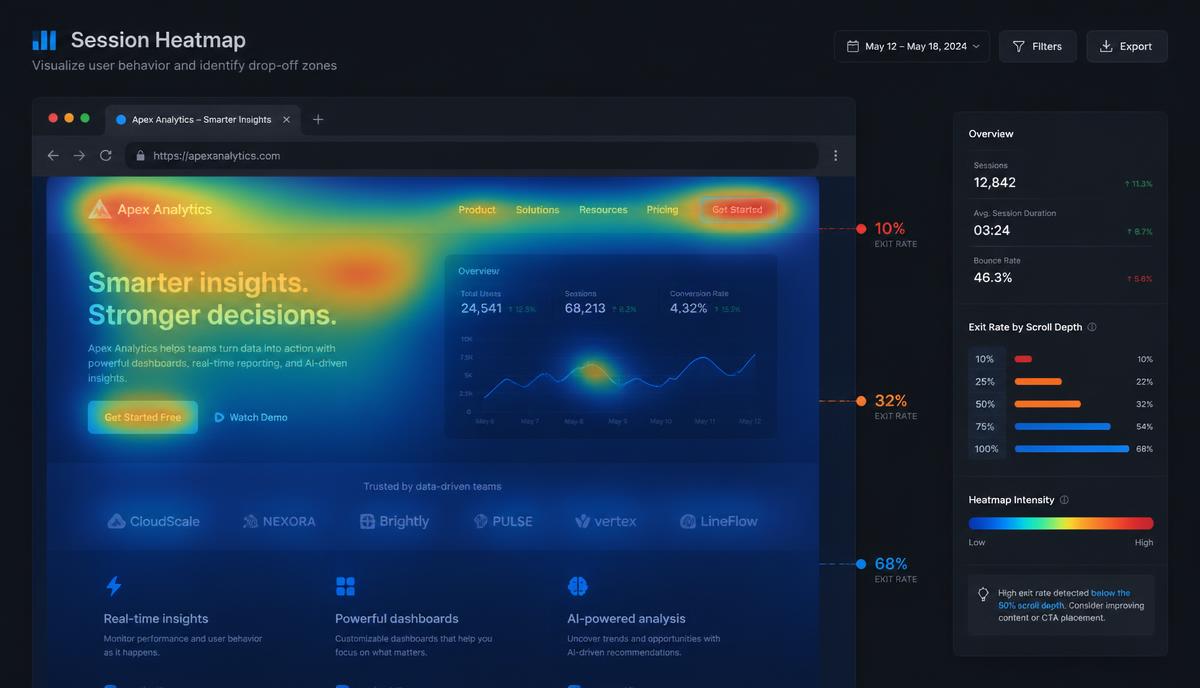
Conversion Optimization
Why Visitors Leave Your Website Without Buying
People rarely leave because they hate your business. They leave because something was unclear, unproven or hard work.
8 min read ·
Read Article →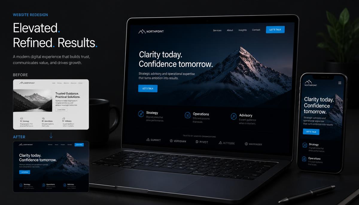
Website & Web Design
5 Signs Your Website Needs a Redesign
A redesign shouldn't just make your website prettier. It should make it work better. Here are the five signals worth acting on.
8 min read ·
Read Article →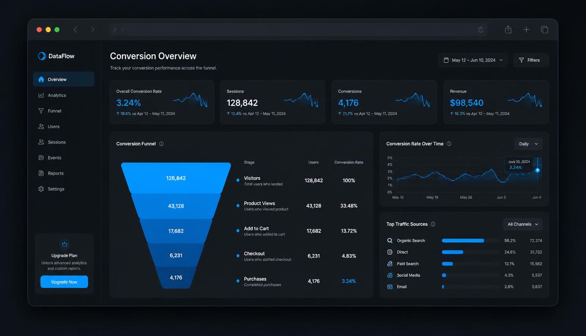
Conversion Optimization
How to Improve Your Website Conversion Rate
Conversion optimisation isn't tricks. It's removing the reasons the right visitors hesitate — in the order that matters.
9 min read ·
Read Article →Want this applied to your business?
Start with a strategy call, or run a free Insight Audit™ and bring the findings with you.