Conversion Optimization · 6 min read
Where Should Your CTA Buttons Go?
Above the fold isn't a rule. CTA placement should follow the moment your visitor becomes convinced.
 Mayowa AdejayanFounder, InsightWeave
Published
"Put the button above the fold" is the most repeated piece of conversion advice and one of the least reliable. It works when the visitor already knows what they want. It fails when they've just arrived and haven't been given a reason to act yet.
A better principle: a call to action belongs wherever a visitor is likely to become convinced — and on most pages, that happens at more than one point.
Above the fold
The first screen should always contain a route forward, because some visitors arrive ready. Keep it simple: one primary action, one optional secondary.
This placement earns its keep on branded search traffic, returning visitors, and campaign landing pages where the ad already did the persuading.
In the hero section
The hero CTA should match the level of commitment a first-time visitor can make. If your service is high-consideration, "See how it works" or "Check my website score" will out-perform "Buy now" — not because it converts better on paper, but because it keeps people moving instead of bouncing.
After the value proposition
Once you've explained what you do and who it's for, some readers have enough information. Give them a way through rather than making them scroll past four more sections to find one.
After the benefits
Benefits sections answer "what's in it for me". The end of that section is a natural decision point, and a CTA there feels like a logical conclusion rather than an interruption.
After social proof
Proof resolves the last question — can I believe this? Placing an action directly after testimonials, case results or client logos captures the confidence you've just built, before the reader's attention moves on.
Near forms
The submit button is a CTA too, and it deserves the same care: outcome-based wording, high contrast, and a short line of reassurance beneath it about response times or obligations.
Keep the form and its heading visible together. A form that scrolls away from its explanation feels like paperwork.
At the end of long-form content
Readers who finish a 1,500-word article are among your most engaged visitors. Close with a relevant, low-friction step tied to the topic they just read about — not a generic sales pitch.
Sticky and mobile CTAs
On mobile, a persistent bar containing the primary action can help on long pages — particularly for calling, booking and enquiry flows. Use it carefully.
- Keep it slim so it doesn't eat the reading area.
- Never let it cover form fields or the submit button.
- Show one action, not a row of competing options.
- Consider revealing it after the first scroll, so the hero isn't crowded.
There is no universal position
Placement should follow four things:
- User intent — how ready is this traffic source to act?
- Page structure — where does the argument reach its natural conclusions?
- Context — an article, a pricing page and a checkout are different situations.
- Conversion goal — a phone call, a form and a purchase carry different levels of commitment.
Practical rule of thumb: one CTA in the hero, one after each major persuasive block, one at the end. On short pages that's two; on long pages it may be five. Repeating the same action is fine — introducing five different actions is not.
Conclusion
Stop asking where the button should go and start asking when the visitor is ready. Map the persuasive moments on the page, place an action at each one, keep them consistent, then check the pattern on a phone before you ship it.
Continue reading
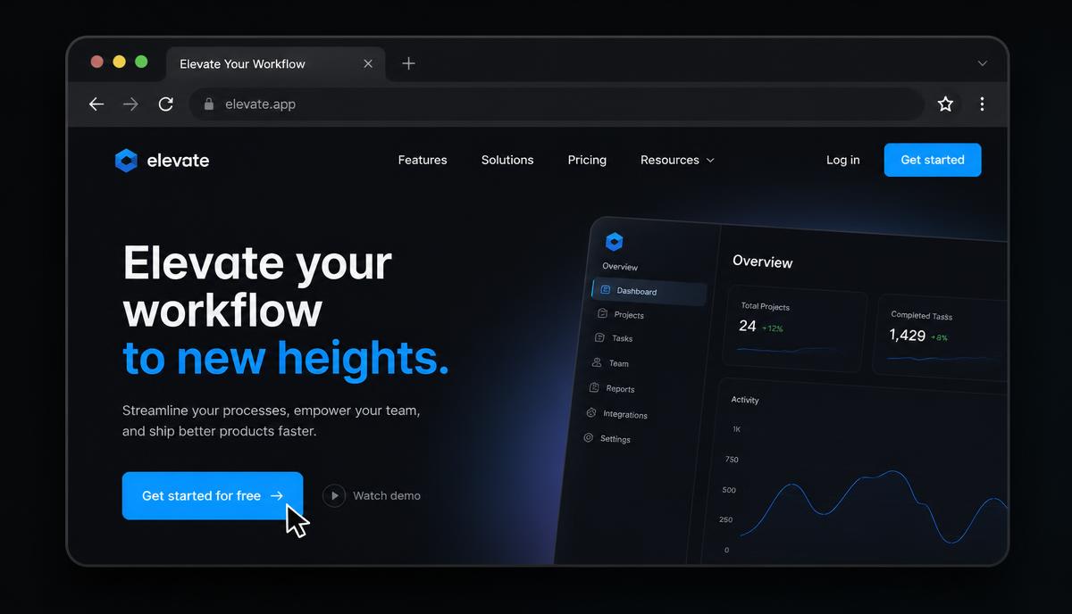
Conversion Optimization
Why Your CTA Button Matters More Than Your Logo
Businesses spend months on a logo and minutes on the button that actually earns the revenue. Here's how to fix that imbalance.
7 min read ·
Read Article →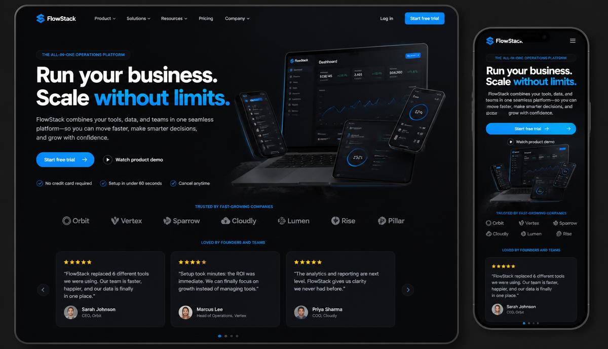
Conversion Optimization
How to Create a Homepage That Converts
A homepage that converts follows a sequence: attention, understanding, interest, trust, action. Here's how to build it.
9 min read ·
Read Article →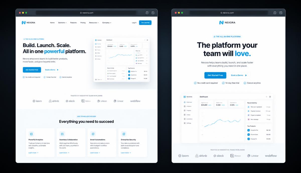
Website & Web Design
Homepage vs Landing Page: What's the Difference?
One page introduces a business to everyone. The other asks one audience to do one thing. Confusing them wastes traffic.
6 min read ·
Read Article →Want this applied to your business?
Start with a strategy call, or run a free Insight Audit™ and bring the findings with you.