Conversion Optimization · 9 min read
How to Create a Homepage That Converts
A homepage that converts follows a sequence: attention, understanding, interest, trust, action. Here's how to build it.
 Mayowa AdejayanFounder, InsightWeave
Published
A homepage has seconds to do three things: say what you do, make it feel credible, and point somewhere useful. The structure below is the one we return to most often, because it follows how people actually decide rather than how businesses like to talk.
The flow underneath it is simple: attention → understanding → interest → trust → action. Every section should advance one of those stages, or it doesn't belong.
1. A clear headline
One sentence, understandable in five seconds, naming what you do and who it's for. Resist the urge to be clever before you've been clear — you can add personality in the tone, not by removing the information.
Test: cover the rest of the page. Could a stranger describe your business from this line alone?
2. A strong value proposition
Directly under the headline, resolve the next question: why you rather than the alternatives? Name the method, the difference, or the specific outcome.
- Be specific about the audience: "for independent clinics" beats "for businesses".
- Name the practical difference — speed, scope, specialism, price model.
- Avoid claims that every competitor also makes.
3. A primary call to action
One dominant action, visible on the first screen, worded as an outcome and matched to what a first-time visitor can realistically commit to. Add one quieter secondary option for those who need more information first.
4. Benefits, framed as outcomes
Three to five benefits, each written from the customer's perspective. "Enquiries answered within an hour, automatically" is a benefit; "AI-powered workflow engine" is a feature. Features can support benefits, but they shouldn't lead.
5. Social proof
Place proof directly after the claims it supports. Named testimonials, real client outcomes, recognisable logos where you have permission — specific and verifiable rather than decorative.
One highly relevant testimonial from a similar business does more than ten generic ones.
6. Trust signals
Beyond testimonials, reduce perceived risk with practical detail: who's on the team, where you're based or which regions you serve, how you work, response times, and clear terms. Never invent credentials or awards — a single unverifiable claim undermines everything around it.
7. Products or services
A short, scannable overview of what you offer with a route into each area. The homepage's job here is routing, not exhaustive explanation — the detail lives on the service pages.
Keep the list to what you actually want to sell. A long menu of everything you've ever done reads as unfocused.
8. Objection handling
Every buyer has three or four recurring worries: cost, timescale, disruption, whether it applies to their sector. Answer them on the page rather than waiting for the sales call.
- Publish a price range or the factors that determine cost.
- State typical timelines and what's expected from the client.
- Address the "will this work for my industry?" question directly.
- A short FAQ near the end handles this well without bloating the page.
9. A secondary call to action
Not everyone is ready to book. Offer a lower-commitment alternative — a diagnostic, a guide, a short call — so interested but hesitant visitors stay connected instead of leaving silently.
10. A clear final action
Close the page with a single, unambiguous next step. No new information, no extra links competing for the click. Restate the offer, add one line of reassurance, and repeat the primary button.
The flow, in one view
| Stage | Sections | Question being answered |
|---|---|---|
| Attention | Headline | Is this relevant to me? |
| Understanding | Value proposition, services | What exactly do they do? |
| Interest | Benefits | What would I get out of it? |
| Trust | Social proof, trust signals, objections | Can I believe this? |
| Action | Primary, secondary and final CTAs | What do I do next? |
Common homepage mistakes
- 1Opening with company history instead of the customer's problem.
- 2A hero carousel that rotates before anyone finishes reading slide one.
- 3Five equally weighted CTAs, so none of them reads as the main one.
- 4Proof stranded on a separate testimonials page.
- 5A design built for desktop that buries the headline under a large image on mobile.
Conclusion
Structure does more for a homepage than styling. Get the sequence right — attention, understanding, interest, trust, action — and even a modest design will out-perform a striking one that makes visitors work out where to go. If your traffic comes from campaigns rather than search, also read Homepage vs Landing Page.
Continue reading
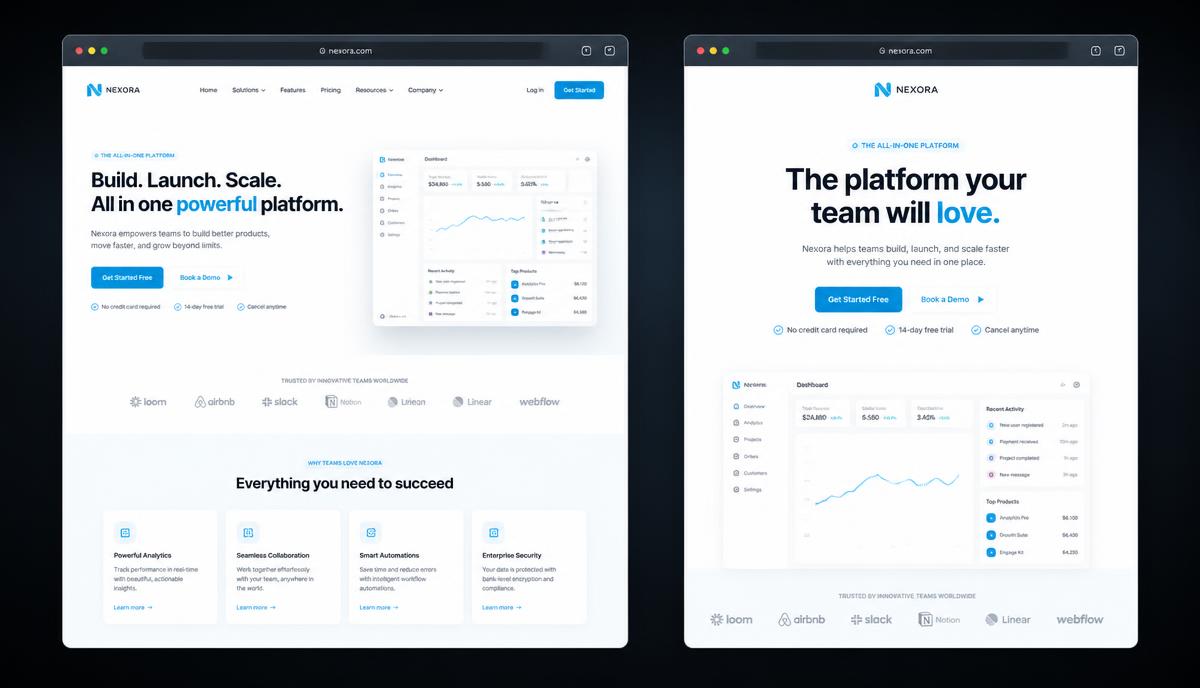
Website & Web Design
Homepage vs Landing Page: What's the Difference?
One page introduces a business to everyone. The other asks one audience to do one thing. Confusing them wastes traffic.
6 min read ·
Read Article →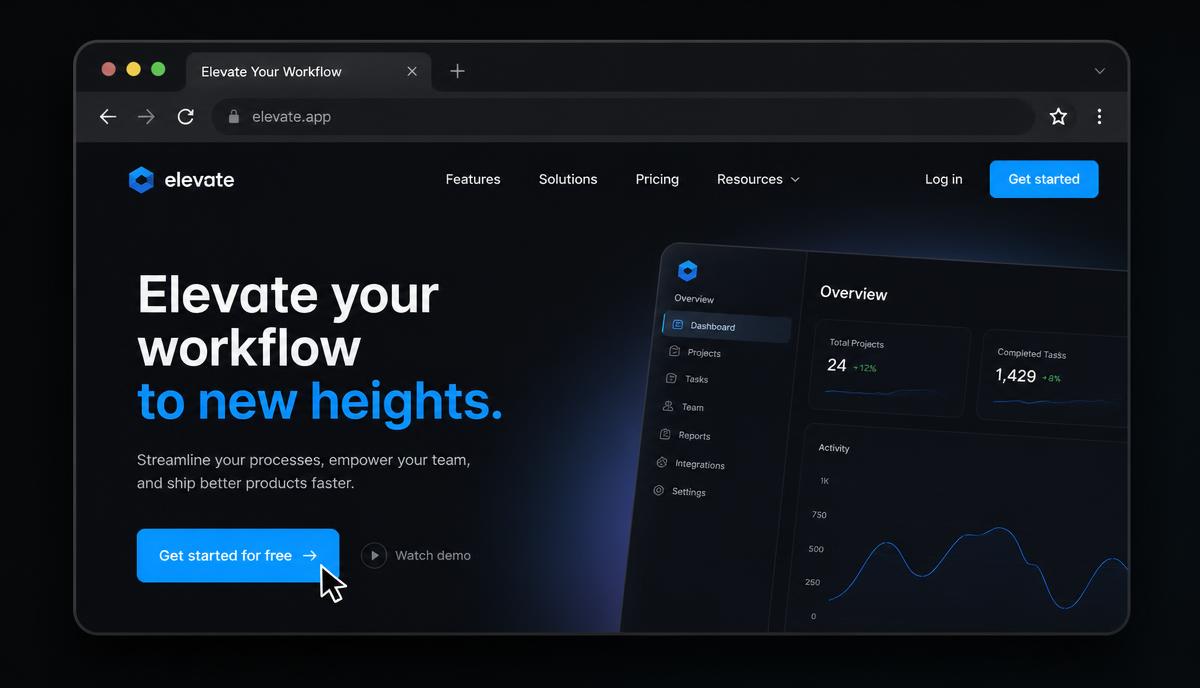
Conversion Optimization
Why Your CTA Button Matters More Than Your Logo
Businesses spend months on a logo and minutes on the button that actually earns the revenue. Here's how to fix that imbalance.
7 min read ·
Read Article →
Website & Web Design
Why Beautiful Websites Still Fail
Design gets attention. Strategy gets results. The gap between the two is where most website budgets disappear.
7 min read ·
Read Article →Want this applied to your business?
Start with a strategy call, or run a free Insight Audit™ and bring the findings with you.