Website & Web Design · 7 min read
Why Beautiful Websites Still Fail
Design gets attention. Strategy gets results. The gap between the two is where most website budgets disappear.
 Mayowa AdejayanFounder, InsightWeave
Published
Every agency has seen it: a site that photographs beautifully in a portfolio and produces almost nothing commercially. The client is proud of it, the team is proud of it, and the enquiry inbox is quiet.
This is not an argument against good design. Good design earns attention and signals credibility. It just isn't sufficient, because a visitor's decision is made on comprehension and confidence, not aesthetics.
Design gets attention. Strategy gets results.
Beautiful ≠ effective
A beautiful website optimises how something looks. An effective website optimises what happens next. They overlap, but they are judged by different measures — one by taste, the other by behaviour.
| Judged on | Beautiful website | Effective website |
|---|---|---|
| Primary goal | Impression | Action |
| Headline | Evocative | Understandable in five seconds |
| Success measure | Compliments | Enquiries, bookings, sales |
| Content order | Visual rhythm | Order the buyer needs information in |
| Risk | Visitors admire and leave | Looks plainer than the mood board |
The best sites are both. The failure mode is treating the first column as the whole brief.
Reason 1: The messaging is vague
Beautiful sites often use short, atmospheric copy because it composes well. "Crafting experiences." "Where ideas grow." It looks calm and confident, and it tells a buyer nothing.
Practical example: a clinic replaced "Care, reimagined" with "Same-week appointments with specialist physiotherapists in three city locations." Nothing about the visual design changed. The second version answers what, who and where — so the visitor can decide whether to keep reading.
Reason 2: There is no conversion path
A conversion path is the sequence a visitor moves through: land, understand, believe, act. Many sites are built as a collection of attractive pages with no sequence at all. Every page ends in a full-stop rather than a next step.
- Each page should have one obvious next action, chosen for the visitor's stage.
- Service pages should lead to enquiry or booking, not back to the homepage.
- Article pages should lead to a low-commitment step, such as a diagnostic or guide.
- Dead ends — pages with no forward link — should be treated as bugs.
Reason 3: The UX is confusing
Confusion rarely announces itself. It shows up as hesitation: unlabelled icon navigation, invented menu names ("Solutions Lab", "The Method"), scroll effects that hide content until an animation finishes, or interactions that behave differently on each page.
Two useful rules. First, name things the way customers name them — "Pricing" beats "Investment". Second, if an interaction needs explanation, it needs replacement.
Reason 4: The site gives no reason to trust it
A stranger is deciding whether to hand over money or contact details. Beautiful, anonymous websites make that harder, not easier, because polish without evidence can read as a facade.
Evidence that carries weight
- Named, specific testimonials rather than anonymous praise.
- Real work: outcomes, context, and what was actually delivered.
- Faces and names of the people who will do the work.
- Clear commercial detail — pricing ranges, timelines, what's included.
- Practical signals: a real address or region, response times, and a working contact route.
Place proof next to the decision, not on a separate testimonials page nobody visits.
Reason 5: The CTAs are unclear
On design-led sites, calls to action are often the first casualty of restraint: thin outlines, low-contrast text, and generic labels like "Get started" that don't say what will happen.
Say the outcome instead — "Book a 30-minute strategy call", "Get the pricing guide", "Check my website score". This matters more than most brand elements, which is the argument in Why Your CTA Button Matters More Than Your Logo.
A quick way to test your own site
- 1Screenshot your homepage on a phone. Cover everything below the first screen. Can a stranger describe your business?
- 2Pick any page at random. Name its single intended next action out loud.
- 3Count the pieces of concrete evidence a visitor sees before reaching your contact form.
- 4Read every button label as a sentence: "I want to ___." If it sounds odd, rewrite it.
Conclusion
Beauty is not the problem — beauty asked to do strategy's job is. Get the message, the sequence, the evidence and the action right, then make it look excellent. That order is what separates a site people admire from a site that earns.
Continue reading
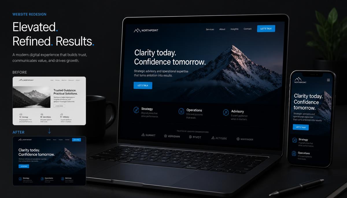
Website & Web Design
5 Signs Your Website Needs a Redesign
A redesign shouldn't just make your website prettier. It should make it work better. Here are the five signals worth acting on.
8 min read ·
Read Article →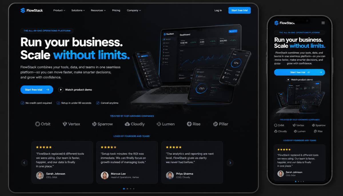
Conversion Optimization
How to Create a Homepage That Converts
A homepage that converts follows a sequence: attention, understanding, interest, trust, action. Here's how to build it.
9 min read ·
Read Article →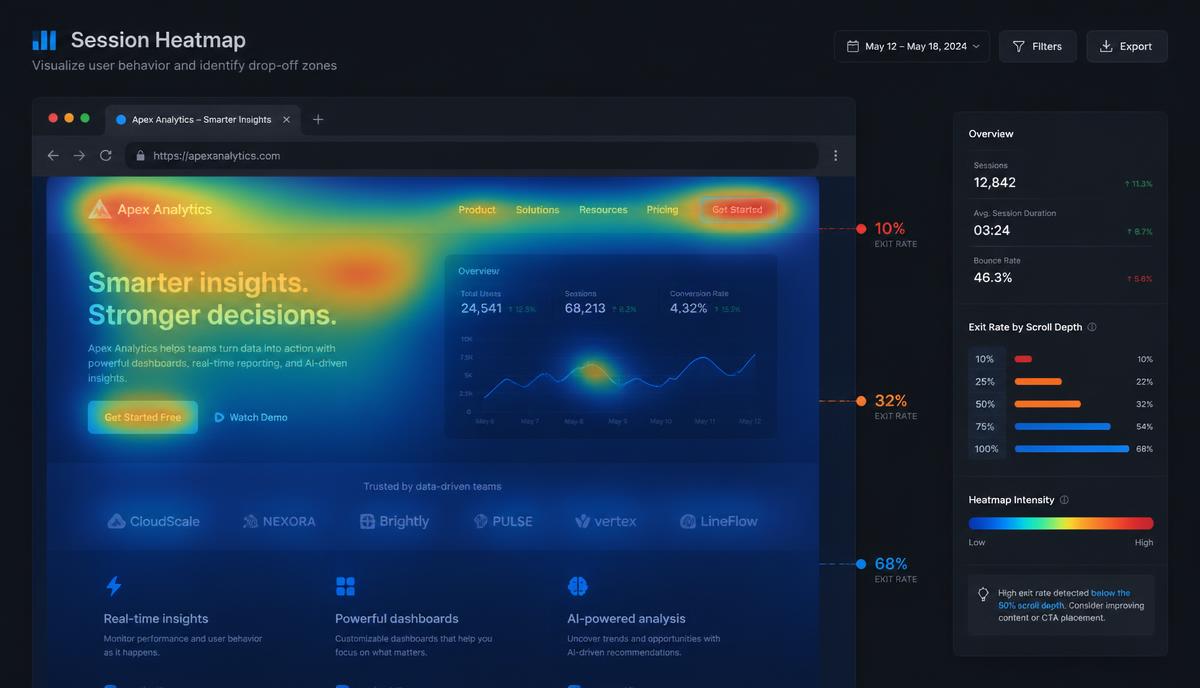
Conversion Optimization
Why Visitors Leave Your Website Without Buying
People rarely leave because they hate your business. They leave because something was unclear, unproven or hard work.
8 min read ·
Read Article →Want this applied to your business?
Start with a strategy call, or run a free Insight Audit™ and bring the findings with you.