Conversion Optimization · 8 min read
Why Visitors Leave Your Website Without Buying
People rarely leave because they hate your business. They leave because something was unclear, unproven or hard work.
 Mayowa AdejayanFounder, InsightWeave
Published
Someone searched for what you sell, clicked your link, and left within a minute. It's tempting to conclude they weren't serious. Usually they were — and something on the page made continuing feel harder than starting again elsewhere.
These are the ten reasons we see most often, with how to spot each one on your own site.
1. They don't understand the offer
The visitor can't tell what they'd actually be buying, how it's delivered, or whether it applies to their situation. Industry language and abstract positioning are the usual culprits.
How to spot it: high exits from service pages and enquiries that ask questions your page was supposed to answer.
The fix: describe the offer in the terms a customer would use, and state what's included and what happens after they get in touch.
2. They don't trust the business yet
No names, no faces, no evidence, no location, no verifiable work. Even a well-designed site reads as risky when there's nothing to check.
The fix: put specific proof next to the decision — a named testimonial by the form, real outcomes by the price, and a genuine contact route in the footer.
3. The page is confusing
Too many sections competing for attention, no clear hierarchy, an unpredictable menu. The visitor can't build a mental map, so they stop trying.
How to spot it: heavy use of your site search, repeated back-navigation, or short visits to many pages in sequence.
4. The call to action isn't clear
Either there isn't an obvious next step, or there are five competing ones. Both produce the same result: nothing.
The fix: one primary action per page, worded as an outcome, repeated at each decision point.
5. The price or value isn't explained
Hiding pricing entirely filters out serious buyers as well as tyre-kickers. Many people simply won't ask.
The fix: if you can't publish fixed prices, publish ranges, typical project sizes, or what drives the cost up and down. Explain the value in the same place — what the buyer gets for it.
6. The process feels difficult
Long forms, mandatory account creation, unclear timelines, or a vague "we'll be in touch" with no indication of when.
- Show the steps: enquiry, call, proposal, start.
- State your response time and honour it.
- Offer more than one contact route — form, phone, direct booking.
- Ask for the minimum information you need to be useful.
7. The website is slow
Delay is abandonment. Visitors lost to loading time never register as engaged sessions, which is exactly why this problem stays invisible in most reports.
How to spot it: an unusually high share of sessions with almost no on-page time, especially on mobile.
8. The mobile experience is poor
Small text, cramped buttons, overflowing tables, pop-ups that can't be dismissed with a thumb. Compare your mobile and desktop conversion rates; a wide gap usually points here.
9. There are too many distractions
Chat widgets, newsletter overlays, cookie banners stacked on discount banners, autoplaying video. Each one is a small tax on attention, and they compound.
The fix: on high-intent pages, keep only what supports the action. Audit your overlays on a phone — that's where they do the most damage.
10. There's no compelling reason to act now
Even a convinced visitor may postpone. Postponement is usually permanent.
The fix: give an honest reason to continue — current availability, delivery timescales, a genuine deadline, or simply a smaller first step such as a short call or a free diagnostic. Avoid invented scarcity; it's easy to detect and expensive to your credibility.
How to find your own friction points
- 1List your top five entry pages and their exit rates.
- 2Walk each page yourself on a phone, on mobile data, as if you'd never seen it.
- 3Ask three people outside your business to complete your main action while thinking aloud.
- 4Read the last 20 enquiries and note every question the site should have answered.
- 5Fix the issue affecting the largest number of visitors first, then measure before moving on.
Conclusion
Most lost visitors were winnable. They needed one more piece of clarity, one more piece of evidence, or one less obstacle. Those are the cheapest improvements available to any business, because the traffic has already been paid for.
Continue reading
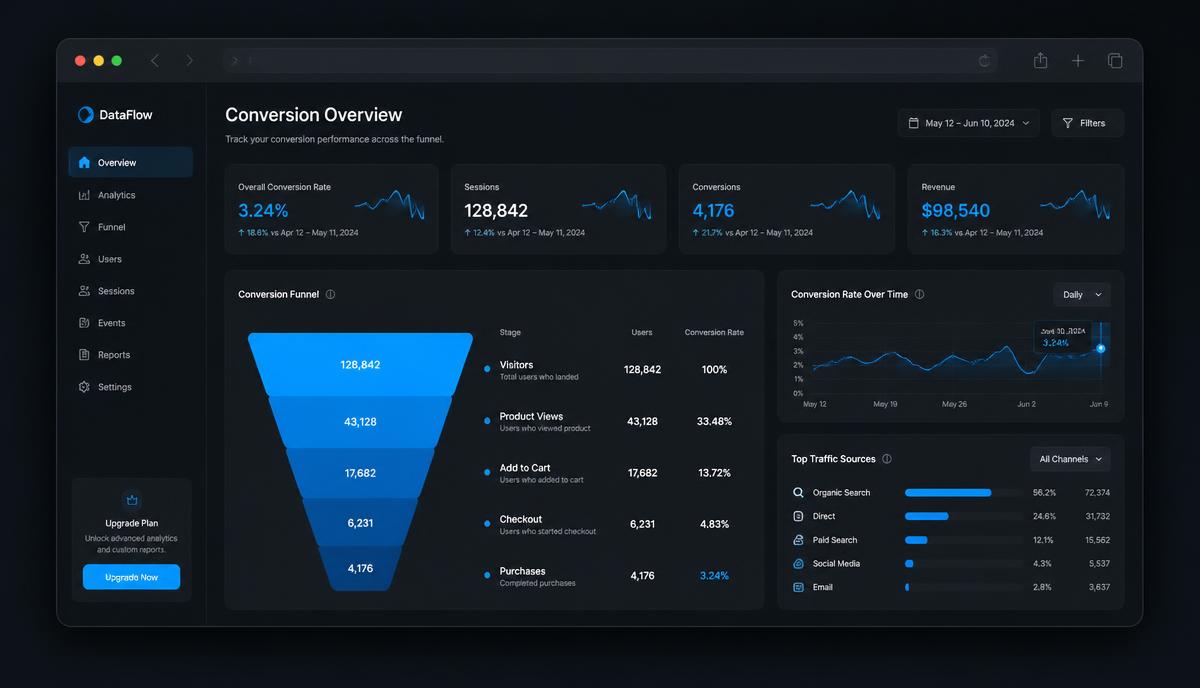
Conversion Optimization
How to Improve Your Website Conversion Rate
Conversion optimisation isn't tricks. It's removing the reasons the right visitors hesitate — in the order that matters.
9 min read ·
Read Article →
Website & Web Design
10 Website Mistakes That Cost Businesses Customers
Ten problems we see repeatedly on business websites, why each one costs money, and the practical fix for each.
9 min read ·
Read Article →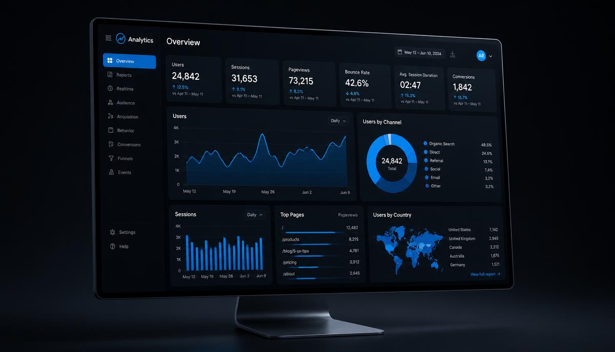
Website & Web Design
How to Know If Your Website Is Actually Working
Getting visitors and getting results are different things. Here's how to tell which one your website is doing.
8 min read ·
Read Article →Want this applied to your business?
Start with a strategy call, or run a free Insight Audit™ and bring the findings with you.